Updates to the website menus and navigation
We have seen a steady increase in mobile users visiting the Virtual Swanage website and decline in desktop users over the past few years.
In the past we designed the website for a desktop first layout and mobile navigation was a secondary consideration, today the situation has reversed with mobile users being the majority visiting the website.
With this change to the user demographic we took the decision to rebuild the top menus and navigation systems to be fully optimised for mobile users without sacrificing the desktop users ease of use and experience.
Today we have launched our latest update to the website with the new mobile optimised navigation system, the new menus use 30% less code resulting in faster loading times and improved display on smaller screens.
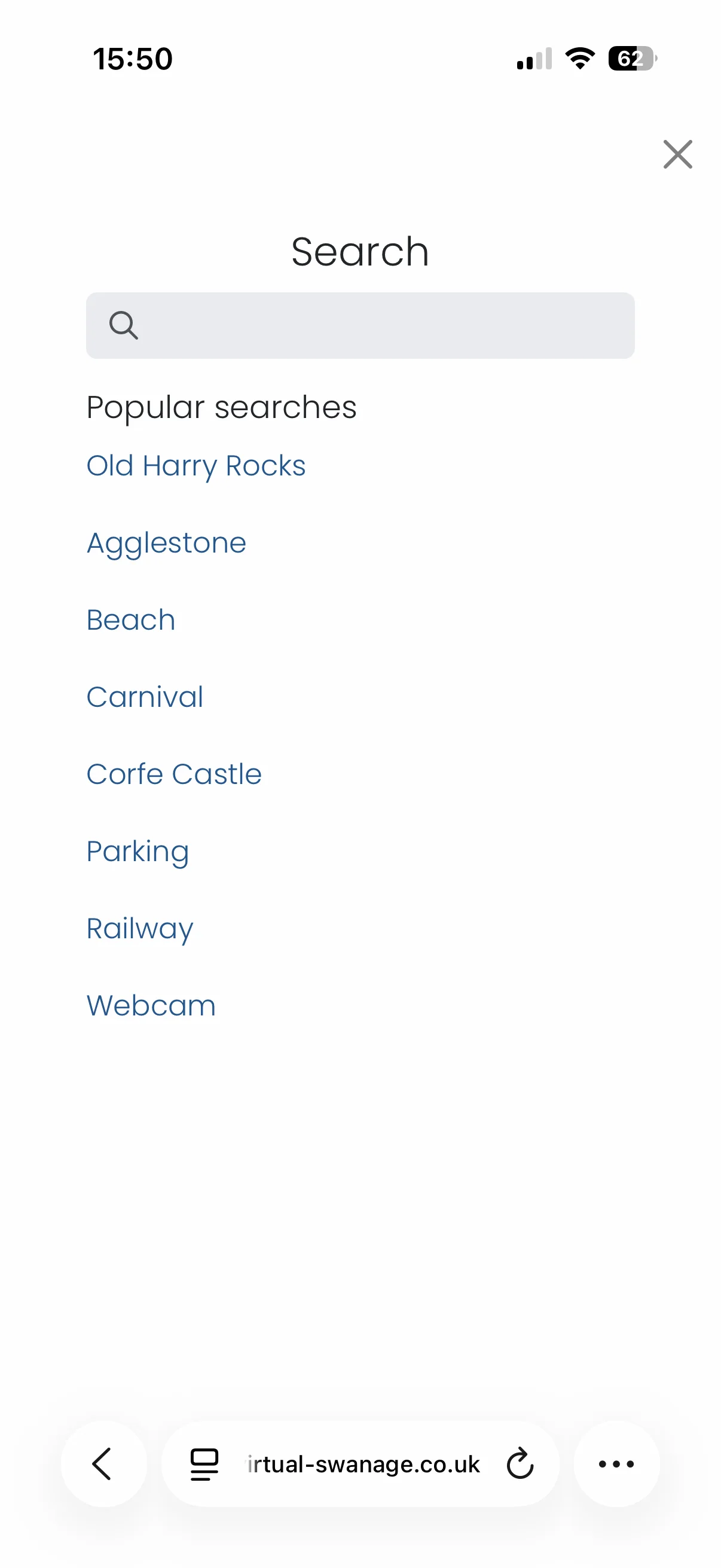
In addition to the menu changes we also updated the mobile search pages to include the most popular searches submitted.
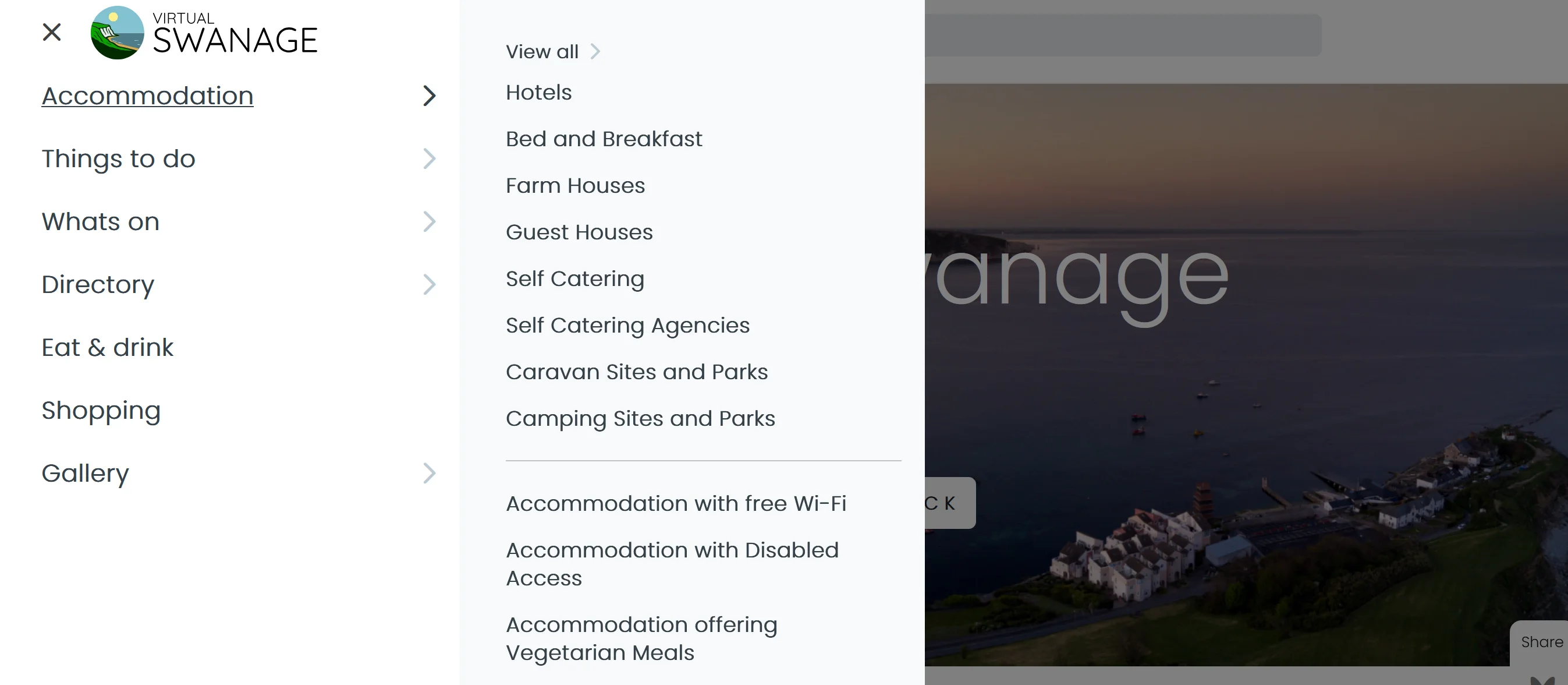
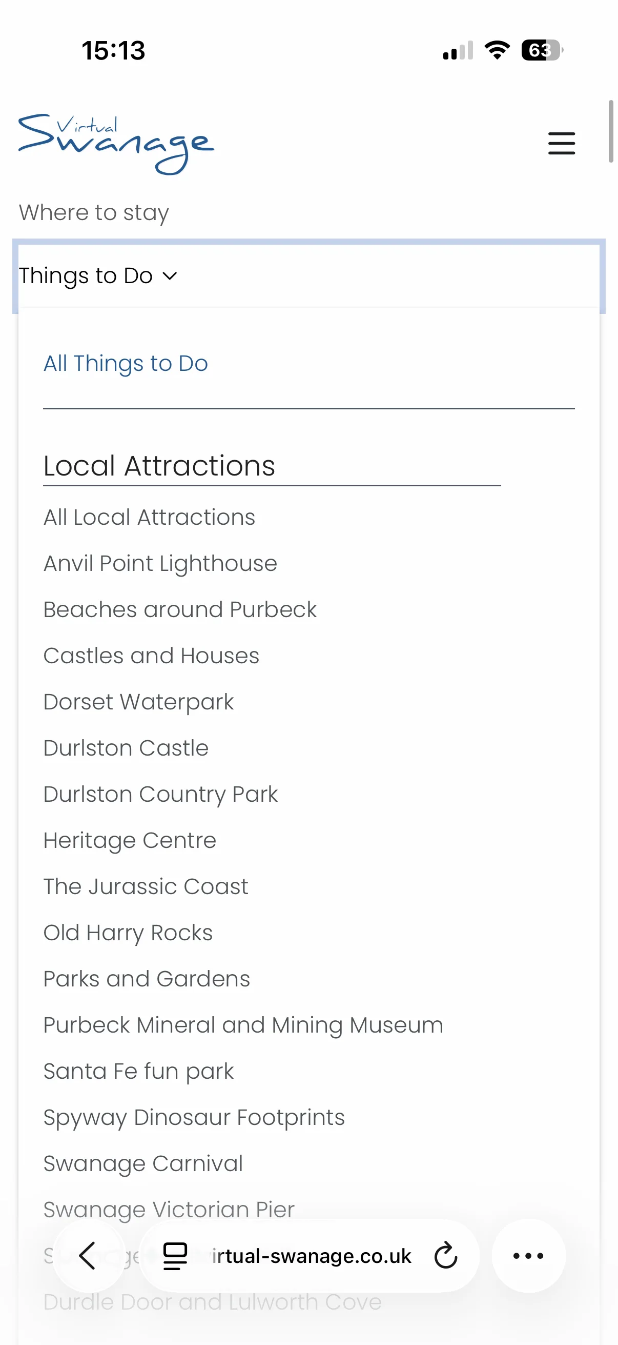
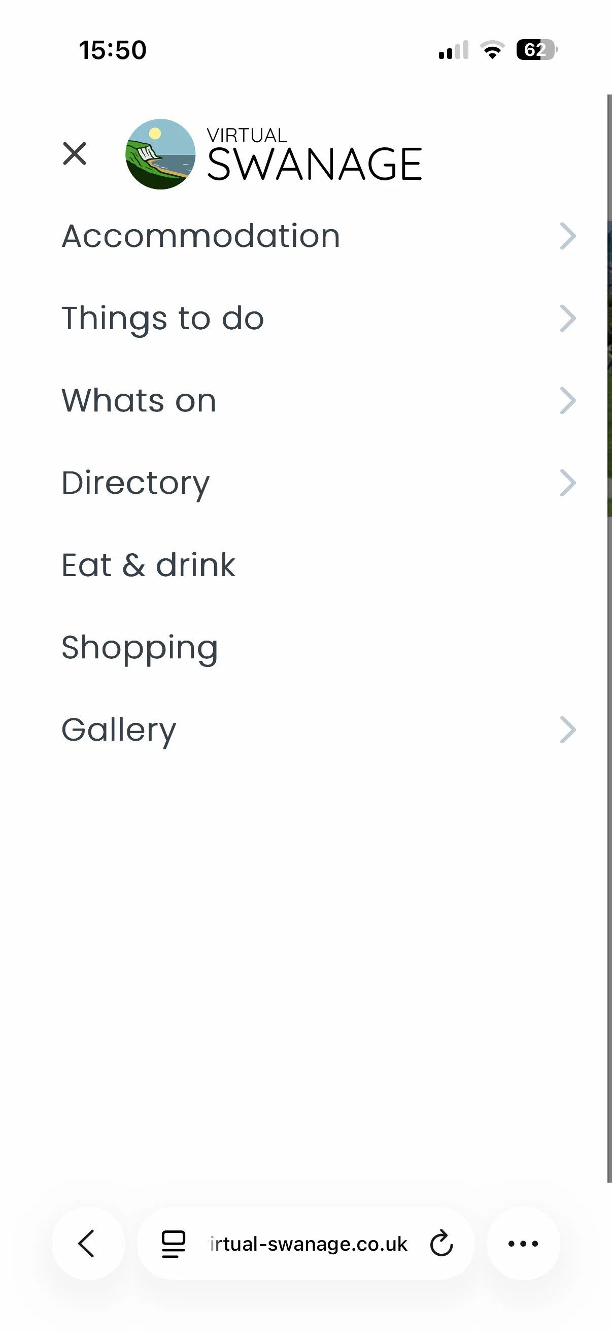
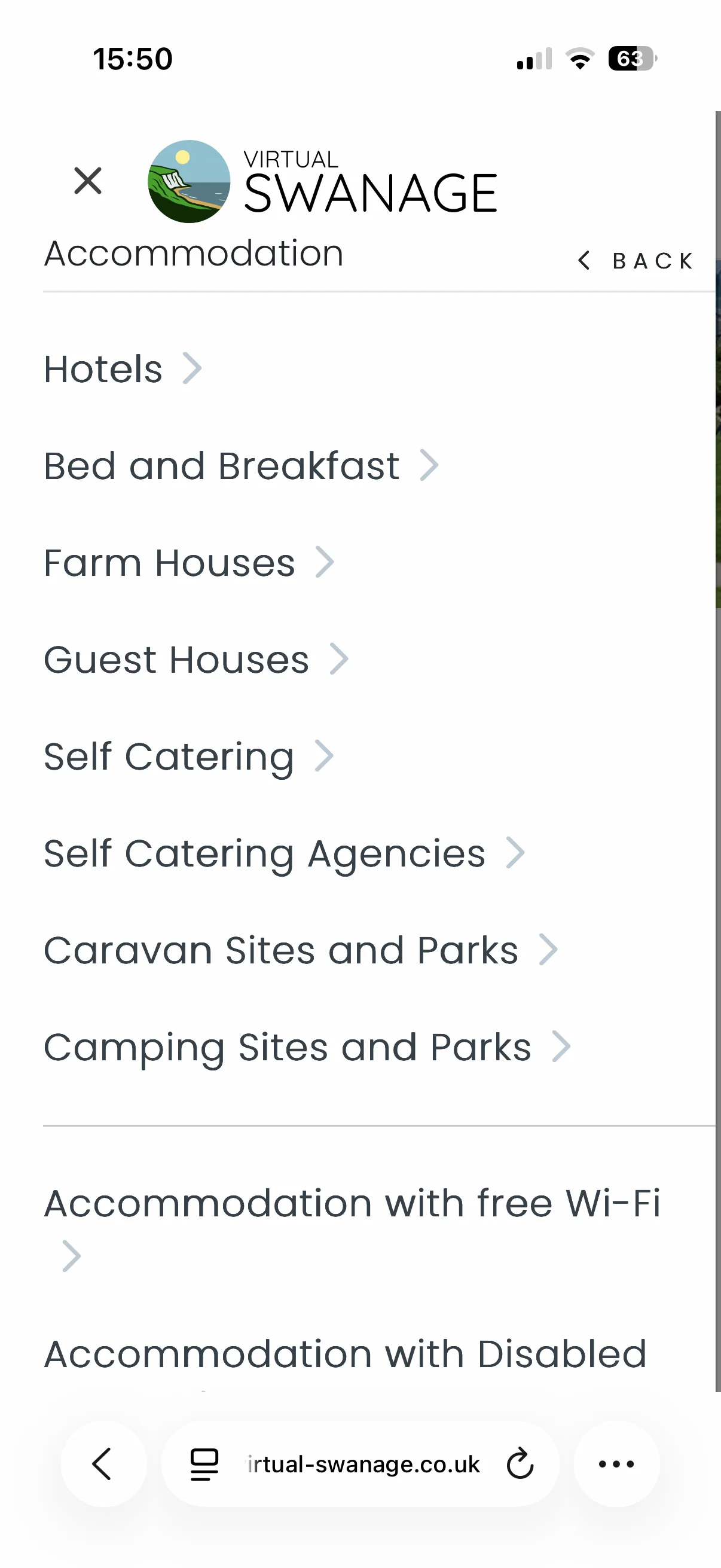
The images below show the changes made to the website.
Old top menu

New top menu

New menu open on Desktop view
Old menu open on mobile
New menu first level open on mobile
New menu second level open on mobile
New menu search view on mobile
We welcome your feedback on the new menus and navigation.